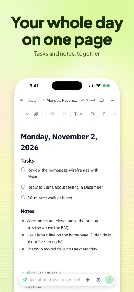
1. The big headline
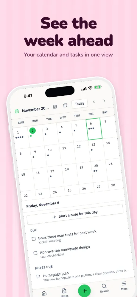
A solid color and a very large line, with the device running off the bottom. It reads at search size, and works when your promise fits in a few words.
Template: Bold Statement
Guide · examples
Good sets share a small number of moves. Here are ten, shown with our own templates and a real notes app, so you can see the idea before you borrow it.
Runs in your browser on a computer · No card until you export
In short
The App Store screenshot patterns worth knowing are the big headline, the soft gradient, dark with glow, frameless, full bleed, panorama, spotlight callout, 3D hero, editorial and the feature grid. Each suits different apps. These examples are our own templates shown with Notii, a notes app by the same maker, rather than other companies' listings, and we don't claim any one of them converts best: test on your own listing.
Whatever you choose, keep it consistent across the set. Apple suggests a similar palette, fonts, message and tone across your assets.
We don't have conversion numbers for these patterns, and we'd be wary of anyone quoting one winner for every app. Apple's product page optimization and Google Play's store listing experiments let you test real variants with your own visitors. More on testing.
Store rules checked November 4, 2026, against Apple's and Google's own pages. They change, so check the source before relying on any one number.
Examples
All shown with our own templates, so you can make any of them with your own app.
A solid color and a very large line, with the device running off the bottom. It reads at search size, and works when your promise fits in a few words.
Template: Bold Statement
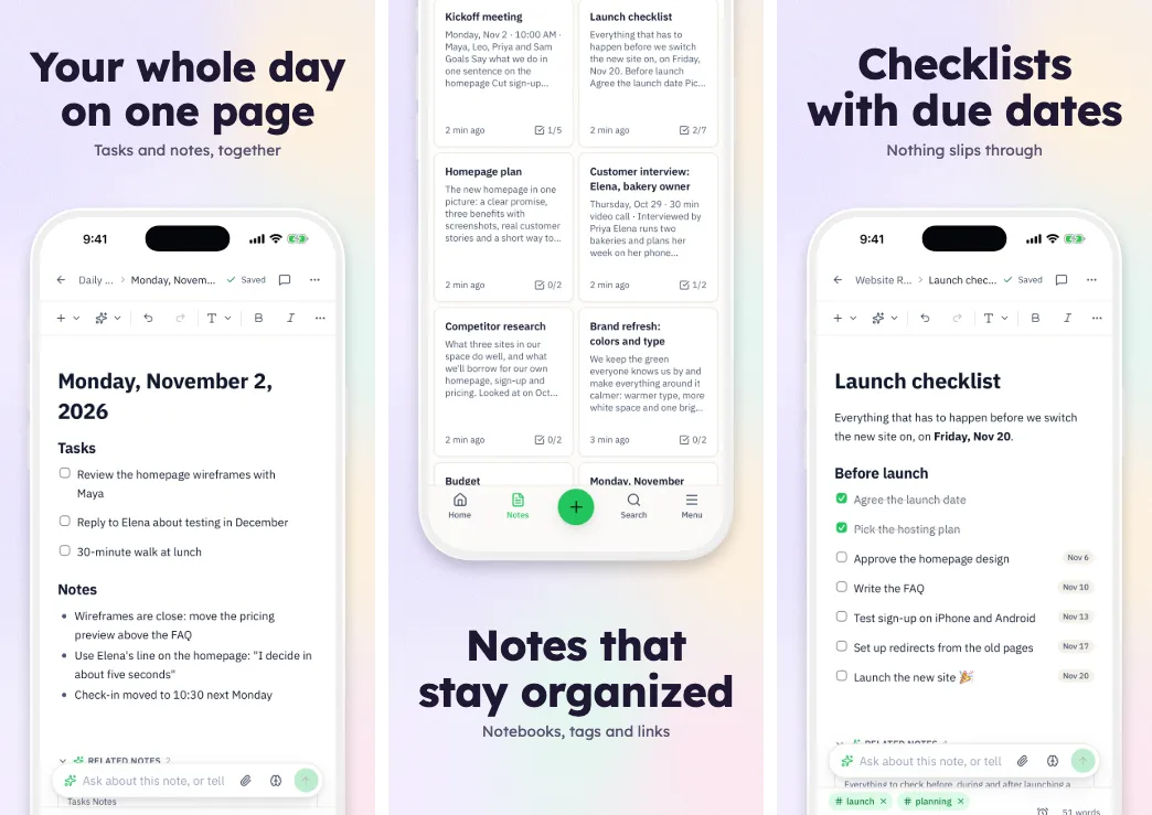
A calm wash of color, a clay frame and sentence-case copy. It suits productivity, health and anything that wants to feel quiet.
Template: Soft Mesh
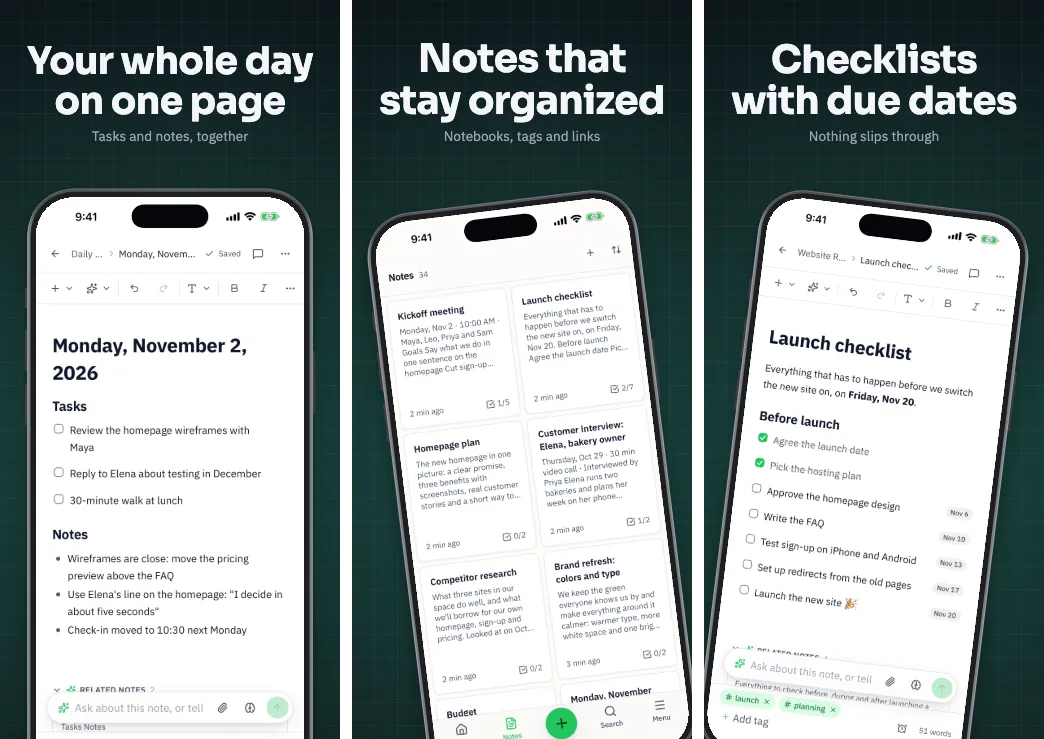
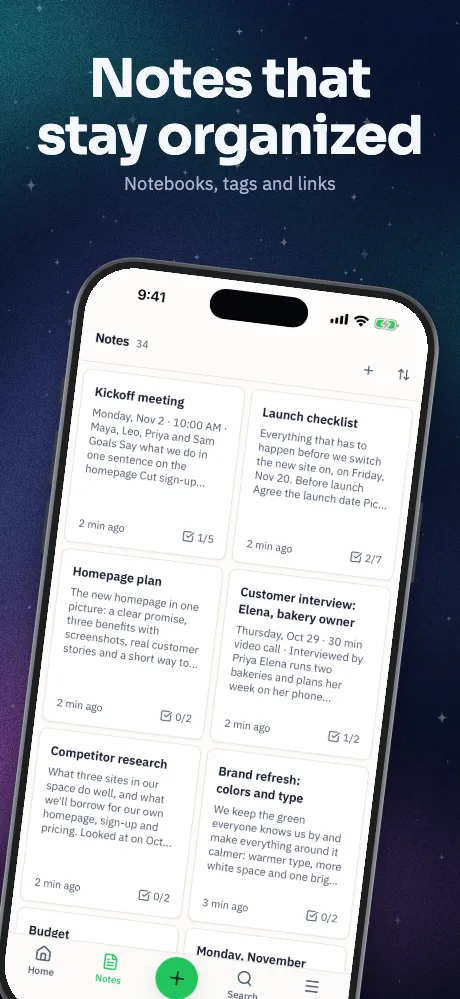
Near-black with one accent glow. It makes bright interfaces stand out, and suits apps with a dark mode worth showing.
Template: Midnight
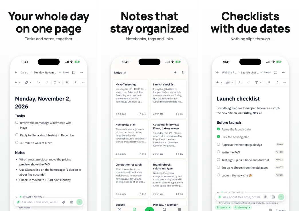
Rounded screenshots with soft shadows and no device. It won't date, gives your interface more room, and follows Google's guidance on device imagery.
Template: Frameless Clean
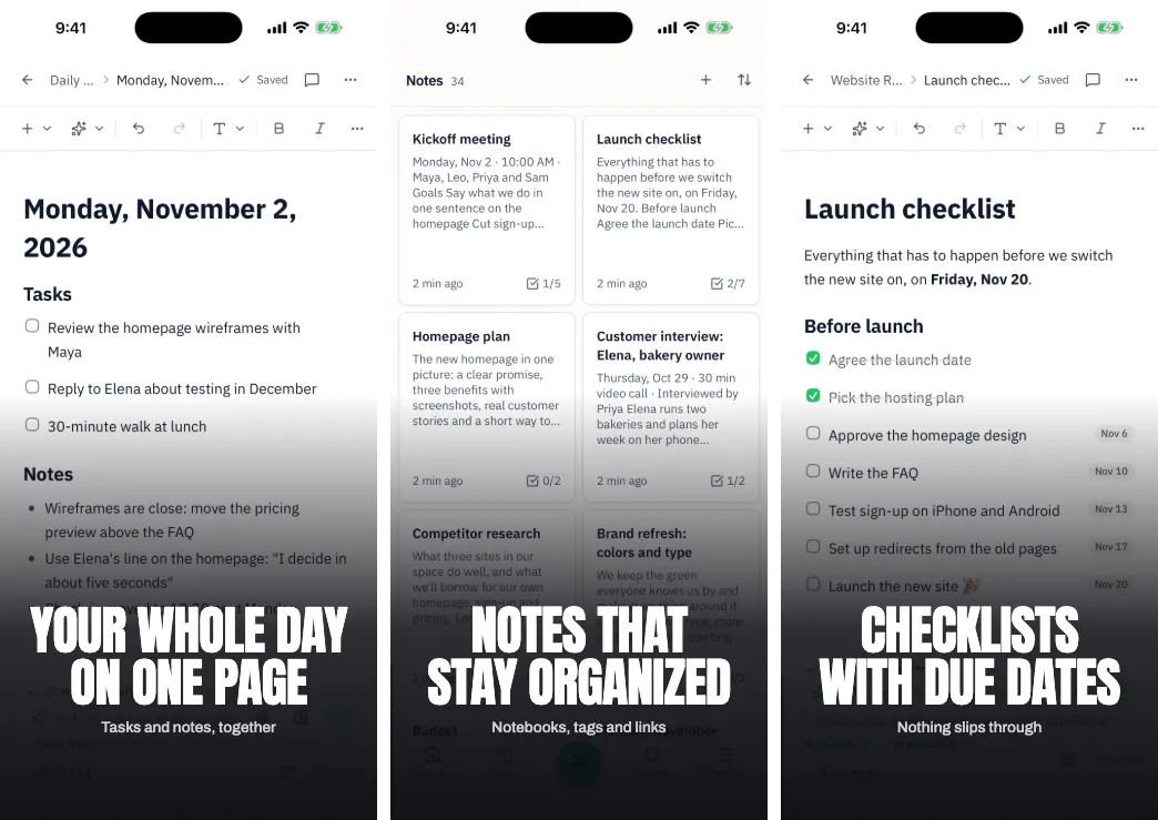
The screen fills the whole image under a gradient, with big type. It's built for games and media, where the picture sells it.
Template: Full Bleed
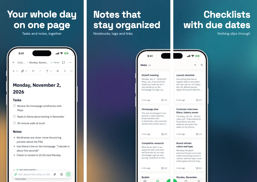
One background across the set, with a device spanning two screens, so people swipe to see the rest. Order matters, since it's a single picture.
Template: Panorama Flow
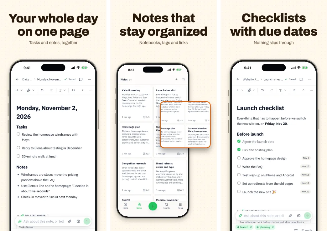
A magnified detail over the device. Use it when the feature is small on screen: a chart, a control or one great line of text.
Template: Spotlight Callout
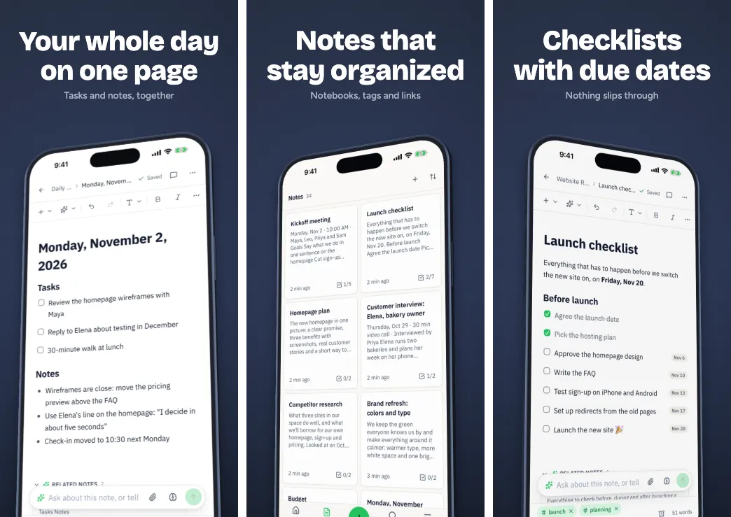
Devices turned in perspective, with the screen following the tilt. It has plenty of presence, but steep angles hide the interface, so keep it to a few screens.
Template: Hero 3D
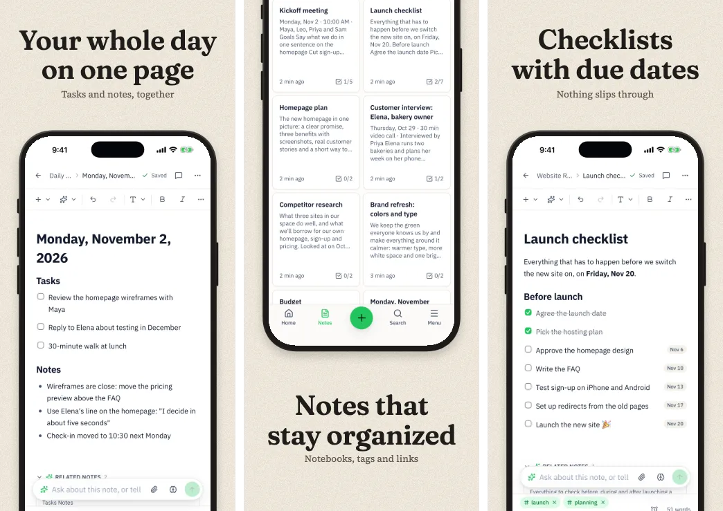
Serif headlines and generous margins, like a magazine. It suits reading, writing, food and travel.
Template: Editorial
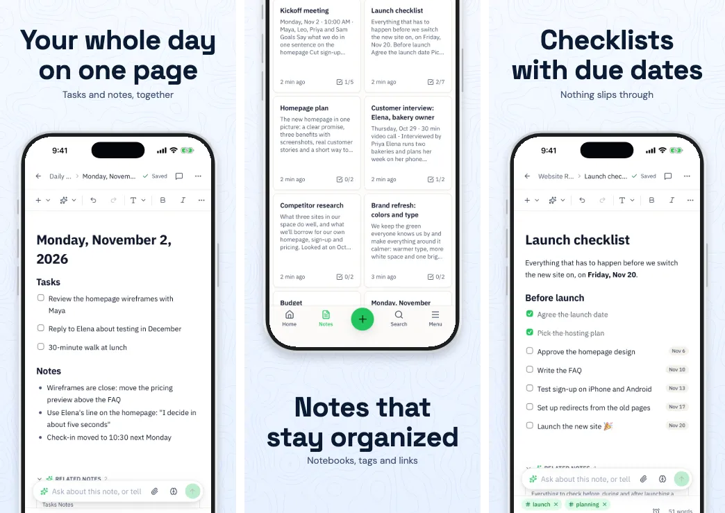
Straightforward feature screens with a closing statement and your icon. It's plain, and clarity is the point: good for utilities.
Template: Feature Grid
Questions
A clear focal point, a short phrase that adds to the picture, and the real app in use. Apple asks for a strong composition and legible text, even when it's small.
Up to 10 are allowed. Up to three can appear in search results, depending on orientation, so make those your strongest. Use as many more as you have good things to show.
Portrait for most apps, so more than one screenshot shows side by side in search. Landscape suits games played that way. Apple says the number shown in search depends on orientation.
They're our own templates, shown with Notii by the same maker, so we can show them without using other companies' work. To browse real listings, look on the App Store itself.
Keep reading
Drop in your screenshots and see them in every template, right now.
Get started